Showing posts with label color. Show all posts

Monday, September 17, 2012

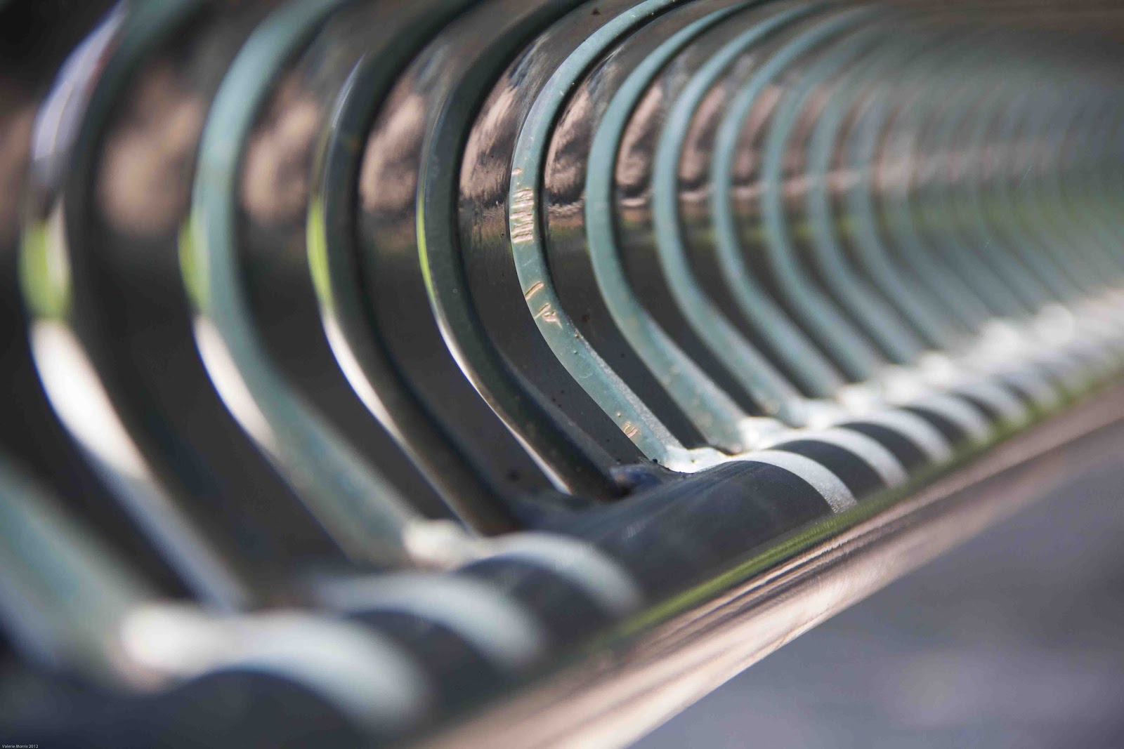
Distortion: Valerie Morris


 In most types of photography, distortion is unwanted. Sometimes it can be desirable because an artist can create art that is one of a kind. Distortion is alteration of an original object that could be hard to figure out what it was in the first place.

Distortion is similar to abstract because there isn’t a true reality to the image. When an image is being distorted, the meaning of the image becomes different. Distortion doesn’t have to be taken so literally but most of the time it is. Your perception and outlook could be distorting how you look at the scene or something you photographing could actually be distorting the image.


Tuesday, August 7, 2012

Color: Angus Hooper

In a world full of wild colors, I enjoy finding unusual examples of urban "Artwork" that has unbelievable colors, shapes and lines.  this dumpster, this wall, the cone, the tree and the debris on the ground made a fun image for my needs. 

Tuesday, July 31, 2012

Color: Mike Bogner


     Colors can express many, many things. Moods, holidays, pride for a team, etc. Blue would be with the feeling down, yellow means scared, grey and black with death. How did each of these colors become connected with that feeling?
     It turns out that there is a whole science and mystery to color theory. I stumbled across some articles after hearing that people with depression see a grayer world. A lot of this makes sense. When I lived in Buffalo, NY, during the winter months, depression in people seemed higher being trapped in doors due to the blizzards. The skies always seemed to be cloudy and grey. The people would seem less active and misserable. Maybe these elements would make us see an even more gray landscape. Much of my art back then would reflect this.
     Now a days I bask in the sun, playing in the sunny wonderful playground we call Colorado. It's very difficult to stay inactive here. Everything I see is so vibrant and alive. Looking back at photos I've captured just this summer, I notice I add a bit more saturation or vibrance to the colors, trying to convey how I saw the scene. The ability of understanding colors and how our eyes perceive it can be a powerful tool in a photographers tool chest. Many photographers in the past have utilized color to express a feeling that is intended for the audience to feel.

Moods and Color

Color - Shalia Boggs

Have you ever heard that color can affect your mood?  Studies suggest that red signifies passion, blue is calming, and yellow puts you in a happy mood.
Think of what the world would be like if we didn't have color; if everything we saw was in black and white.  Would everyone be walking around with a sad face?  Or would everyone be the same because they were none the wiser?  What would it be like to be colorblind?  These are the questions I wonder.
For this shoot, I immediately thought of flowers at the Denver Botanic Garden.  I was caught off guard when a bee did a drive-by my face.  Or maybe it was a fly-by.  I had to see what the fuss was about and saw this gorgeous giant-sized dandelion.
Dandelions were my grandmother's favorite flower, so when I saw this, I had to take a picture of it.  Partnered with my affection for bees, but only the kind with the fur that kind of makes me want to pet them, it was perfect.  It's just too bad that bees and I don't have mutual feelings for each other.

Color: Andrew Wyman

     A color can have many meanings, in both a literal and an abstract sense. Here we see a colored traffic light. We know that green means go and red means stop. Those two colors also have other meanings in our society as well. A person can be red in the face with embarrassment or be in a red fiery rage. Someone can also be green with envy.
     Colors sometimes tell us more than we realize. Sometimes, they tell us what to do or how to interact in a certain place. Other times, they give us a more emotional or visceral feeling about something. Without color, my world would be a vast empty space with little or no variety.

For more information about meaning of color in other cultures: http://www.globalization-group.com/edge/resources/color-meanings-by-culture/

Monday, July 30, 2012

Color - Scott Kotelnicki


Naturals color - Here I have captured the remnants of last years fall against the green enriched background of this years new growth.

This shot was taken at 8:58 in the morning well past the golden hour of sunrise but because it was with in a shaded area it was able to take on the warm yellows and orange associated with sunrise.
 
A Canon 7D was used with a 60mm Macro lens f2.8 at 1/100.


www.kotelnickiphoto.com

Color: Valerie Morris

Color can play an important role in the world we live in. Especially our food, we eat daily. Color can influence our thinking, change our actions, and cause reactions. When food looks pleasing, it can raise our blood pressure, and appetite. The opposite could suppress the urge to eat anything.

For example, red in foods are very intense and energetic. It increases blood pressure and stimulates appetite. Whereas blue is associated with, the mind, body, and can produce a calming effect while slowing the metabolism. Lastly, green is associated with nature, and being healthy. For more information on which colors can influence eating habits go to http://astronutrition.com/blog/how_colors_affect_your_appetite

Color: Andrew Pusbach


Colorado is well known for its vividly colored wildflowers, lush green valleys, and beautiful mountain ranges. Whenever I visit the Maroon Bells Wilderness Area I am overwhelmed by the experience, between the stunning peaks, the crystal clear mountain lakes, and towering aspen trees.

 Despite their beauty, the Maroon Bells are considered to be two of the most dangerous peaks in the state. They are often referred to as the “Deadly Bells.” They have claimed the lives of many an ambitious climber over the years, however, this does not stop people from reaching their summits.
 The Maroon Bells are some of the most well-known peaks in the state, and as such, are photographed constantly. Due to this, the real challenge when photographing them is walking away with a unique image.

When photographing the Maroon Bells, I prefer to visit them during the summer rather than in the fall because there are fewer photographers. As I watched the morning unfold I began to notice the interesting clouds moving above me creating dynamic shapes and patterns in the sky. The image above was my favorite from the morning.

Sunday, July 29, 2012

Color: Matthew Moore

Color of Life © 2012 Matthew Moore

This week while pondering the concept of color I thought to myself "what better way to illustrate color then to get out and photography people and things at an event." In my experience, event's typically illustrate a sense of culture and diversity through it's vendors (via their items for sell—as in the image above), its performances, as well as those in attendance.

In Colorado, one is certain to find something going on just about every weekend in this state of over 300 days of sunshine.  I was lucky to discover that just about fifteen minutes from my home the 11th annual Colorado Dragon Boat Festival (CDBF) was going on.

The CDBF celebrates Denver’s rich and diverse Asian communities through performing arts and a marketplace as well as the main event—an ancient sport of Dragon Boat Racing at Sloan’s Lake Park.  This year the event is expecting around 52 competing teams.

Additional Links:

Color: Brandon Chapin


What better to bring happiness to everyone then a carnival!  The sounds, smells, and colorful lights evoke some sort of childish reactions that, no matter your age will have you excited and ready to play the games and ride the rides.  When I go to a carnival, though, I always just wander around looking at the beautiful lights that have a color range bigger than my childhood box of crayons.  It is always fun to just watch the Ferris Wheel go 'round and 'round creating colorful light streak circles in the sky.

Monday, July 16, 2012

Abstract: Valerie Morris


Have you ever truly stopped and looked at what is around you? Our world is amazing and filled with many possibilities. If you would just take a few seconds in your busy schedule, and really looked at what you touch throughout the day. What would you see? 


Would you see the ordinary object or would you see colors, textures, and shapes that appear repeatedly. If you can open your eyes to this, you just looked at the objects in an abstract way.


Abstract art can be the most ordinary objects, we see every day. However, they may not look like it. Truthfully, it’s not really about the objects. It’s about what the objects can create through design.

Monday, June 11, 2012

Beauty: Andrea Frase


Beauty can be a hard thing to notice if you're not looking for it. There is beauty all around you, but maybe this summer you want to have that beauty right in your own back yard. Here are a few great places to go for roses, lilacs, and maybe even some pansies to give a little more color. I hope everyone takes the time out of their day to stop and smell the roses, just be careful not to smell the bees.

Tuesday, June 5, 2012

Heather Zindars: Beauty


The perfection and beauty of this insect is indescribable.  This photo was captured at The Butterfly Pavilion, in Westminster, Colorado where civilians can enter a magical world of butterflies flying freely around them.  I love the juxtaposition of the beautiful butterfly placed perfectly at the dying part of the leaf.  As he eats the leaf, his proboscis is perfectly curled, and the tip of his antennae appears to glow in delight.  These type of photographs are difficult to capture since you can't control the placement and movement of the butterfly.  I was lucky to capture this moment.

Monday, April 23, 2012

Funky: Christine Saler


Add some funk to your style with these cool funky hemp bracelets. They're cheap and easy to make and are fun to wear. It's a great pass time for mothers and daughters. They're great to give as gifts for all of your friends and family. All you need are beads of your choice and a ball of hemp string. Check out Hemp Jewelry for more ideas and how to make your own.

Google+
Flickr

Sunday, February 27, 2011

Rich: Emily Schulte


Recently I've been a little obsessed with painting.  When I should be doing my homework, I chose to paint instead, but at least it's better than watching television or cruising the internet all day.  While painting the other day, I saw a great photo opportunity to demonstrate the concept "rich" right in front me.  I realized while I was mixing paint that the colors seemed to all blend together and look very rich.  That is what I tried to capture in this image.  Thanks to my lensbaby, I was able to make all the colors blend together in order to create the same feeling I felt while painting.

Monday, January 31, 2011

Texture

I love crafting, cutting, pasting, gluing, melting, and really using any medium to create. I was working with crayons for a personal project and realized they would work perfect for the texture concept. It is interesting to me that a simple crayon can have so many different textures, smooth, rough, jagged, shiny, dull. I had fun putting this together and think it represents the concept well.

Monday, August 9, 2010

Color - Frank Gallagher


"Color in Action" I believe that color doesn't have to be standing still to still be beautiful.

Sunday, August 8, 2010

Color? How about Color Blindness!


What is color? Most people don’t think twice about the colors they are seeing when they look at a rainbow or a bouquet of flowers. Wikipedia defines it as "the visual perceptual property corresponding in humans to the categories called red, green, blue and others." I define color as one of my personal hells. I love to look at the things of color, but in the last 10 months I have had to re-evaluate what I see. Color is not equal for all people, for those of us who are color blind and love the art of photography or any art form that involves color, it is definitely not equal. When you look at something and you are not sure what color you are looking at, it can be really frustrating. I found out I was colorblind 25 years ago and it explained a lot of things growing up. Last November I had my color blindness retested and I found out it has gotten worse. Taking color photographs is great and I love to do it. PRINTING color photographs can be somewhat challenging. Why? Color cast! So what is color? What you see is probably not what I see. But the real question is who see's the more beautiful color image? Do you appreciates your color vision or take it for granted?